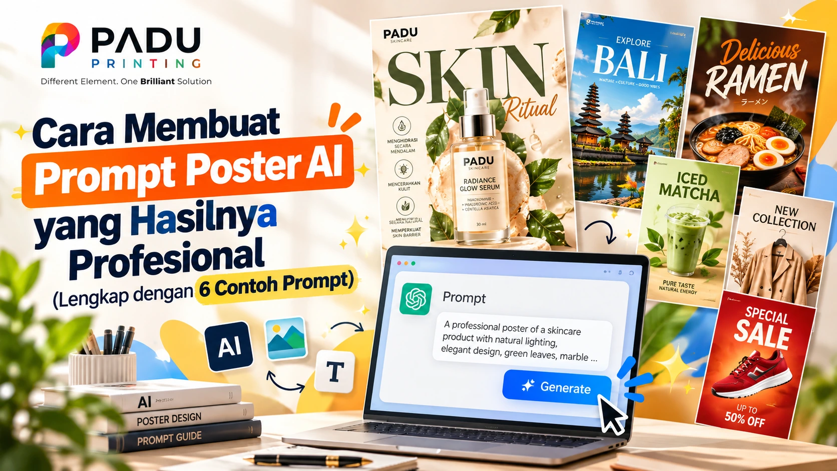
Cara Membuat Prompt Poster AI yang Hasilnya Profesional (Lengkap dengan 6 Contoh Prompt)
Pernah mengetik prompt poster ke AI, lalu hasilnya malah penuh teks berantakan, warna tidak nyambung, dan tata letak tidak bisa dipakai? Masalahnya hampir selalu ada di prompt, bukan di AI-nya. Prompt yang asal-asalan menghasilkan gambar yang asal-asalan.
Poster berbeda dari gambar biasa. Poster punya tujuan (menjual, mengundang, menginformasikan), harus punya ruang untuk teks, dan nantinya sering dicetak. Karena itu cara menulis prompt-nya pun berbeda. Artikel ini membahas rumus prompt poster, template yang bisa langsung dipakai, 6 contoh prompt lengkap, sampai persiapan file sebelum dicetak.
Kenapa Prompt Poster Berbeda dari Prompt Gambar Biasa
Prompt gambar biasa cukup menjelaskan apa yang ada di gambar. Prompt poster harus menjelaskan lebih banyak hal:
Fungsi: poster ini untuk apa dan dilihat siapa.
Tata letak: di mana objek utama, di mana ruang kosong untuk judul dan informasi.
Teks: kata apa yang harus muncul, dan seperti apa gayanya.
Format: rasio dan ukuran, supaya hasilnya tidak terpotong saat dicetak.
Tanpa empat hal ini, AI akan menebak sendiri, dan tebakannya jarang sesuai kebutuhan bisnismu.
Rumus Prompt Poster: 8 Komponen
Gunakan 8 komponen berikut secara berurutan. Tidak harus semuanya dipakai di setiap poster, tapi semakin lengkap, semakin terkendali hasilnya.
1. Format dan tujuan
Sebutkan bahwa ini poster, rasionya, dan untuk apa.
Contoh: Vertical poster design, 2:3 aspect ratio, for a coffee shop promotion.
2. Subjek utama
Deskripsikan objek utama sespesifik mungkin: jenis, posisi, kondisi, detail kecil.
Contoh: a tall glass of iced caramel latte with condensed-milk swirls, water droplets on the glass, coffee beans scattered around.
Semakin spesifik subjeknya, semakin kecil kemungkinan AI menggambar sesuatu yang generik.
3. Komposisi dan ruang teks
Ini komponen yang paling sering dilupakan. Beri tahu AI di mana subjek berada dan di mana area kosong untuk teks.
Contoh: subject centered in the lower two-thirds, clean empty space in the top third for the headline, balanced layout.
4. Gaya visual
Tentukan gaya agar hasil konsisten: premium food photography, flat vector illustration, retro risograph print, minimalist studio product shot, bold typographic poster, dan sebagainya.
5. Palet warna
Sebut 2-4 warna utama, idealnya sesuai warna brand. Contoh: cream, caramel brown, and deep green accent. Warna yang disebut jelas membuat poster terlihat terencana, bukan acak.
6. Pencahayaan dan suasana
Contoh: soft golden-hour window light, bright studio lighting, dramatic neon glow, warm and cozy mood. Komponen ini mengubah kesan poster dari datar menjadi hidup.
7. Teks di poster
Tulis teks yang ingin muncul di dalam tanda kutip, lalu jelaskan posisi dan gayanya.
Contoh: headline “BUY 1 GET 1” in bold condensed sans-serif at the top, subtext “Setiap Jumat, 14.00-17.00” below it.
Tips: semakin sedikit teks, semakin besar peluang tulisannya benar. Batasi maksimal 1 headline, 1 subteks, dan 1 baris footer.
8. Batasan (apa yang tidak boleh muncul)
Akhiri prompt dengan hal-hal yang ingin dihindari.
Contoh: Avoid: extra text, watermarks, distorted hands, misspelled words, cluttered background, low contrast.
Template Prompt Poster Siap Pakai
Salin template ini, lalu ganti bagian dalam kurung:
[Vertical/Horizontal] poster design, [rasio], for [tujuan: promo / event / grand opening / edukasi]. [Subjek utama dengan detail]. [Posisi subjek] with clean empty space at [atas/bawah/samping] for text. [Gaya visual], [2-4 warna] color palette, [jenis cahaya], [suasana]. Text: headline “[judul]” in [gaya huruf] at [posisi], subtext “[info tambahan]”, footer “[kontak/alamat]”. Avoid: extra text, watermarks, misspelled words, cluttered layout.
Catatan bahasa: sebagian besar tool AI gambar kini memahami Bahasa Indonesia, tetapi deskripsi visual dalam Bahasa Inggris umumnya lebih konsisten. Cara paling aman: tulis instruksi visual dalam Bahasa Inggris, dan tulis teks poster dalam Bahasa Indonesia di dalam tanda kutip.
6 Contoh Prompt Poster Lengkap
Contoh 1: Poster Promo Kedai Kopi
Kebutuhan: promo Buy 1 Get 1 untuk dipasang di kedai dan media sosial.
Vertical poster design, 2:3 aspect ratio, for a coffee shop promotion. A tall glass of hand-poured iced caramel latte with condensed-milk swirls, water droplets on the glass, coffee beans scattered around, shot from a slightly low angle. Subject in the lower two-thirds, clean empty space in the top third for the headline. Warm cafe aesthetic, cream and caramel brown palette with a deep green accent, soft golden-hour window light, shallow depth of field, premium food photography style. Text: headline “BUY 1 GET 1” in bold condensed sans-serif at the top, subtext “Setiap Jumat, 14.00-17.00” below it, small footer “Kopi Senja - Jl. Merdeka No. 10”. Clean layout, high contrast, readable typography. Avoid: extra text, watermarks, distorted hands, misspelled words, cluttered background.
Kenapa efektif: subjek spesifik, ruang headline ditentukan, warna dan cahaya jelas, teks dibatasi tiga elemen.
Contoh 2: Poster Webinar atau Seminar Flat Vector
Kebutuhan: mengundang peserta webinar bisnis.
Vertical poster design, 4:5 aspect ratio, for a free business webinar. Modern flat vector illustration of a laptop with growth charts, a megaphone, and abstract geometric shapes floating around, placed on the right side. Left side has clean empty space for text. Navy blue and bright orange color palette on a soft off-white background, professional and energetic mood, minimal and tidy layout. Text: headline “DIGITAL MARKETING UNTUK UMKM” in bold sans-serif, tag “WEBINAR GRATIS” in an orange rounded label above it, subtext “Sabtu, 14 November 2026 • 10.00 WIB”, footer “Daftar via link di bio”. Avoid: stock photo faces, extra text, watermarks, misspelled words, gradients that reduce readability.
Kenapa efektif: gaya flat vector membuat teks mudah dibaca, dan tata letak kiri-kanan memberi struktur yang jelas.
Contoh 3: Poster Produk Skincare Minimalis
Kebutuhan: poster peluncuran produk perawatan kulit dengan kesan premium.
Vertical poster design, 2:3 aspect ratio, for a skincare product launch. A single unbranded frosted glass dropper bottle standing on a round white marble pedestal, soft pastel peach backdrop, a few green leaves casting gentle shadows. Product centered, generous empty space above and below. Minimalist luxury studio product photography, peach, cream, and sage green palette, soft diffused studio lighting, calm and clean mood. Text: small elegant serif headline “Glow, Naturally.” at the top, tiny footer “Segera hadir”. Avoid: clutter, harsh shadows, extra text, watermarks, misspelled words, logos.
Kenapa efektif: satu produk, banyak ruang kosong, dan teks sangat minim. Sangat aman untuk hasil akurat.
Contoh 4: Poster Grand Opening Toko
Kebutuhan: pengumuman pembukaan toko dengan suasana meriah.
Vertical poster design, 3:4 aspect ratio, for a store grand opening. Festive flat illustration of a storefront with a ribbon being cut, confetti, balloons, and gift boxes, placed in the lower half. Bold red, sunny yellow, and white color palette, bright cheerful lighting, joyful and energetic mood. Large empty area at the top for text. Text: giant headline “GRAND OPENING” in thick bold display letters, subtext “Diskon 30% semua produk • 20-22 November”, footer “Jl. Otista Raya No. 170, Jakarta Timur”. Strong contrast, readable from a distance. Avoid: tiny text, extra words, watermarks, misspelled words, messy background.
Kenapa efektif: poster pembukaan perlu terbaca dari jauh, jadi prompt menekankan huruf besar dan kontras kuat.
Contoh 5: Poster Sale Akhir Tahun (Tipografi Dominan)
Kebutuhan: poster diskon dengan angka besar sebagai pusat perhatian.
Vertical poster design, 2:3 aspect ratio, for an end-of-year sale. Bold typographic poster where the giant number “50%” fills most of the canvas, with simple geometric shapes and star bursts behind it. Neo-brutalist graphic style, black, electric yellow, and hot pink palette, flat colors, thick outlines, high contrast. Text: huge “50%” in heavy sans-serif, “DISKON AKHIR TAHUN” above it, “Berlaku sampai 31 Desember” below it. Avoid: photos, gradients, extra text, watermarks, misspelled words, low contrast.
Kenapa efektif: poster tipografi tidak bergantung pada ilustrasi rumit, sehingga cocok untuk promo cepat.
Contoh 6: Poster Festival Musik Lokal
Kebutuhan: poster acara komunitas dengan karakter kuat.
Vertical poster design, 2:3 aspect ratio, for a local music festival. Retro risograph print style illustration of a stage with silhouettes of musicians, a big sun, and stylized sound waves. Limited color palette of teal, coral, and mustard yellow on cream paper texture, visible grain and slight misregistration for a handmade feel, warm nostalgic mood. Empty space at the top for the title. Text: headline “SUARA KOTA FEST” in chunky retro letters, subtext “28 Desember 2026 • Lapangan Kota”, footer “Tiket di link bio”. Avoid: modern glossy look, extra text, watermarks, misspelled words, too many colors.
Kenapa efektif: gaya yang spesifik (risograph) dengan batas warna membuat hasil punya identitas, bukan terlihat seperti template.
Cara Menyempurnakan Hasil (Iterasi)
Hasil pertama jarang langsung sempurna. Jangan menulis ulang seluruh prompt. Ubah satu hal per percobaan, supaya kamu tahu perubahan mana yang berpengaruh.
Contoh instruksi revisi:
Keep the same composition, but change the color palette to navy and gold.
Make the empty space at the top larger so the headline has more room.
Reduce the background detail and increase contrast between the subject and the background.
Keep everything the same, but change the headline to “PROMO RAMADAN”.
Make the lighting softer and warmer.
Jika sebuah tool terus gagal menulis teks dengan benar, jangan memaksa. Lihat bagian berikut.
Kesalahan Umum yang Membuat Poster AI Gagal
Terlalu banyak teks di prompt. Poster dengan 10 baris teks hampir pasti ada yang salah ketik. Batasi 3 elemen teks.
Tidak menyebut ruang teks. AI akan memenuhi seluruh kanvas dengan objek, sehingga tidak ada tempat untuk judul.
Deskripsi terlalu umum. “Poster makanan enak” menghasilkan gambar generik. Sebutkan jenis makanan, sudut pandang, dan suasananya.
Gaya dan warna dicampur terlalu banyak. Pilih satu gaya dan 2-4 warna.
Tidak mengecek ejaan. Periksa setiap huruf di hasil akhir, terutama nama brand, alamat, tanggal, dan nomor kontak.
Lupa rasio. Poster cetak butuh rasio yang sesuai ukuran. Salah rasio berarti bagian gambar terpotong.
Strategi paling aman untuk teks: minta AI membuat visual dan ruang kosongnya saja, lalu tambahkan teks, logo, dan kontak sendiri di Canva, Photoshop, atau aplikasi desain lain. Dengan cara ini, teks selalu akurat dan font bisa disesuaikan dengan brand.
Persiapan Sebelum Dicetak
Gambar yang bagus di layar belum tentu siap cetak. Cek hal-hal berikut:
Rasio dan ukuran. Ukuran kertas seri A memiliki rasio sekitar 1:1,414. Buat gambar dengan rasio 2:3 atau 3:4, lalu crop sesuai ukuran akhir.
Resolusi. Idealnya 300 DPI pada ukuran cetak. Sebagai acuan, A4 sekitar 2480 x 3508 piksel dan A3 sekitar 3508 x 4961 piksel. Jika hasil AI lebih kecil, gunakan fitur upscale.
Bleed. Beri tambahan area sekitar 3 mm di tiap sisi agar tidak ada garis putih saat dipotong.
Safe area. Jauhkan teks penting minimal 5-10 mm dari tepi poster.
Mode warna. Layar memakai RGB, sedangkan mesin cetak memakai CMYK. Warna neon atau sangat terang bisa terlihat lebih kusam saat dicetak, jadi lakukan konversi dan cek hasilnya.
Ketajaman teks kecil. Pastikan teks kecil tetap terbaca di ukuran cetak yang sebenarnya.
Jika ragu dengan ukuran, bahan, atau finishing, konsultasikan file ke percetakan sebelum cetak dalam jumlah banyak.
Checklist Prompt Poster Sebelum Klik Generate
Format dan rasio sudah disebut
Tujuan poster jelas (promo, event, edukasi, dll.)
Subjek utama spesifik
Ruang kosong untuk teks sudah ditentukan
Satu gaya visual dan 2-4 warna
Pencahayaan dan suasana disebut
Teks maksimal 3 elemen, ditulis dalam tanda kutip
Ada daftar hal yang dihindari
Pertanyaan yang Sering Diajukan
Apakah prompt harus Bahasa Inggris? Tidak wajib. Banyak tool sudah paham Bahasa Indonesia, tetapi instruksi visual dalam Bahasa Inggris biasanya lebih konsisten. Teks yang tampil di poster tetap bisa Bahasa Indonesia.
Kenapa teks di poster AI sering salah? Model gambar menggambar huruf sebagai bentuk visual, bukan mengetik kata. Beberapa tool sudah jauh lebih baik dalam hal teks, tetapi tetap perlu dicek manual. Untuk hasil paling aman, tambahkan teks di aplikasi desain.
Berapa panjang prompt yang ideal? Sekitar 80-150 kata sudah cukup untuk poster. Lebih panjang dari itu justru bisa membuat AI mengabaikan sebagian instruksi.
Apakah hasil AI aman dipakai untuk poster komersial? Cek ketentuan lisensi di tool yang kamu pakai, dan hindari meminta logo, karakter, atau wajah tokoh yang bukan milikmu.
Apakah hasil AI bisa langsung dicetak? Bisa, selama resolusi, rasio, bleed, dan warnanya sudah disiapkan seperti pada bagian persiapan cetak di atas.
Bonus Prompt Super Detail Padu Skincare
PADU SKINCARE - LUXURY EDITORIAL LAUNCH POSTER
Create a premium, vertical skincare advertising poster for PADU, featuring a luxurious Radiance Glow Serum. The design should resemble a high-end botanical skincare campaign photographed and art-directed for a luxury beauty magazine.
Canvas and format: Vertical 2:3 aspect ratio, high resolution, suitable for professional digital advertising and print adaptation.
Visual Direction
Use a sophisticated luxury editorial aesthetic combining photorealistic skincare product photography, oversized elegant typography, sculptural natural materials, botanical elements, and carefully structured informational sections.
The overall atmosphere should feel warm, naturally radiant, sophisticated, clean, and premium. The composition should be visually rich and detailed, similar to a professionally designed luxury skincare campaign, without looking cluttered.
Color Palette
Use a harmonious palette of warm ivory, soft cream, pale champagne, muted sage green, deep olive, and warm caramel brown.
Suggested colors:
Warm ivory: #F5F0E6
Soft cream: #F8F3EA
Pale champagne: #E9D7BE
Muted sage: #8B9273
Deep olive: #414A30
Warm brown: #594638
Use warm ivory as the dominant background, deep olive for oversized typography and selected accents, and champagne tones for natural materials and serum highlights.
Main Product Photography
Place a single frosted glass serum dropper bottle prominently in the center of the composition, standing upright on a round, pale cream marble pedestal.
The bottle contains a translucent, warm champagne-colored serum, with a refined metallic champagne-gold dropper collar and a clean white pipette bulb.
The packaging should appear realistic, premium, and physically believable, with accurate glass thickness, natural refraction, subtle reflections, delicate highlights, and realistic serum visibility.
Include a clean cream-colored product label featuring the following exact text:
PADU
RADIANCE GLOW SERUM
NIACINAMIDE
HYALURONIC ACID
CENTELLA ASIATICA
30 ml
Keep the label centered, proportionate, sharp, and readable. Do not introduce additional logos or unrelated product information.
Sculptural Environment
Build an elegant still-life scene around the serum bottle using layered cream marble, natural limestone, and sculptural skincare cream textures.
Place a large, softly textured circular stone form behind the bottle to create depth and visual separation.
Add a controlled amount of glossy translucent serum and creamy skincare swirls around the pedestal. Allow a few realistic serum droplets to catch the light and create a refined sense of movement.
Include natural green leaves with visible veins, realistic surface texture, and subtle imperfections. Position selected leaves around the lower-left area, behind the product, and along the outer edges of the composition.
The botanical styling should frame the product and complement the packaging without obscuring the label.
Typography and Layout
Use a luxury beauty magazine layout with an asymmetrical editorial grid, oversized high-contrast serif typography, refined italic lettering, and clean modern sans-serif supporting text.
Top-left corner:
Place a sophisticated PADU wordmark in deep olive green, followed by a small uppercase descriptor:
SKINCARE
Top-right corner:
Add a small, neatly aligned uppercase tagline:
NATURAL CARE
FOR BRIGHTER SKIN
Upper section:
Create an oversized uppercase serif headline reading:
SKIN
Use deep olive green with elegant, high-contrast letterforms. The headline should span much of the upper canvas and interact visually with the central product composition.
Place the word “Ritual” in an elegant warm-brown italic serif across the right side, partially overlapping the headline area without compromising legibility.
Below it, add a small uppercase descriptor:
WITH PADU
Left Information Column
Create a vertically aligned product-benefit section along the left side, using delicate olive line icons enclosed in thin circular outlines.
Include four benefits, each with its own icon and concise uppercase typography:
MENGHIDRASI
SECARA MENDALAMMENCERAHKAN
KULITMENUTRISI
SECARA NATURALMEMPERKUAT
SKIN BARRIER
Separate the section visually using subtle vertical rules and small circular markers.
Use minimalist line icons representing hydration, radiance, botanical nourishment, and skin protection. Maintain consistent stroke width, spacing, and alignment.
Right Information Column
Place a refined editorial copy section to the right of the serum bottle, with generous spacing and a clear hierarchy.
Headline:
Kulit Sehat
Lebih Bercahaya
Setiap Hari
Supporting paragraph:
Perawatan sederhana
dengan bahan pilihan
untuk kulit yang lebih sehat,
lembap, dan bercahaya
secara alami.
Use elegant serif typography for the headline and a clean sans-serif for the supporting paragraph. Keep the text readable and avoid overcrowding.
Lower Information Sections
In the lower-left area, include a small uppercase heading:
COCOK UNTUK
SEMUA JENIS KULIT
Below it, arrange four minimal line icons with short labels:
NORMAL
KERING
BERMINYAK
SENSITIF
In the lower-right area, create an ingredient information panel with a small uppercase heading:
DENGAN
BAHAN ALAMI
BERKUALITAS
Arrange three small circular ingredient images or realistic ingredient textures, each with its corresponding label:
NIACINAMIDE
HYALURONIC
ACID
CENTELLA
ASIATICA
Use thin divider lines and generous spacing to create a refined scientific-skincare editorial aesthetic.
Bottom Callout
At the bottom center, place a dark olive-green rounded capsule containing elegant, widely spaced white uppercase text:
SEGERA HADIR
Frame the capsule with two thin horizontal olive lines, maintaining a balanced and sophisticated composition.
Lighting and Photography
Use soft, directional studio lighting inspired by warm natural window light entering from the upper-left side.
Create gentle botanical shadows on the ivory background, subtle highlights on the glass bottle, realistic reflections on the metallic collar, and believable contact shadows beneath the pedestal.
Maintain natural tonal transitions, detailed surface textures, controlled highlights, and soft but visible depth.
The serum should appear luminous and translucent rather than opaque or artificially glowing.
Final Quality Requirements
The finished poster must look like a real, professionally art-directed luxury skincare campaign.
Prioritize realistic product photography, elegant typography, refined composition, believable materials, botanical sophistication, and clear information hierarchy.
Keep all text aligned to an intentional editorial grid. Ensure that the product label, benefit descriptions, ingredient names, and callout are spelled correctly.
Avoid excessive gradients, harsh shadows, oversaturated colors, cluttered decoration, cartoon illustrations, obvious CGI, artificial plastic textures, distorted packaging, duplicate bottles, random text, misspelled words, watermarks, and unrelated logos.
The final result should feel luxurious, naturally radiant, visually rich, and unmistakably branded PADU.